
Design Tips for the Non-Designer: Hierarchy + Typography
When someone receives your designed flyer or postcard in their mailbox, they may only spend 2-3 seconds looking at it before they decide to either keep reading or to trash it.
It’s imperative the viewer sees the most important information first to entice them to keep reading. Hierarchy can make or break a good design piece.
In the last post, I walked you through how to use alignment and white space when creating pieces like flyers, cards and advertisements. If you missed it, you can check it out here.
In this post, I’ll go a step further and discuss hierarchy and typography.

1 | Hierarchy
Before you begin styling your text, evaluate which information is the most important, next-to-most important, and least important.
The most important information should be called out above the rest of the group.
A few ways to set information apart include using:
Bold
All Caps
Script fonts
Color
I don’t suggest using all of these methods, but simply choose one or two.
Only the most important items should be bolded. If over half the content is bold, it’s no longer calling out one specific item, but instead calling out every piece and therefore losing hierarchy.
Space out the important information. Try not to clump it together, but instead disperse it evenly throughout the content.
A good way to test if you have used the correct hierarchy, is to step back and look at your design with fresh eyes.
At first glance, what is the very first thing you notice?
If the first thing you notice is the most important information, you have succeeded!
Here’s an example of properly-used hierarchy.
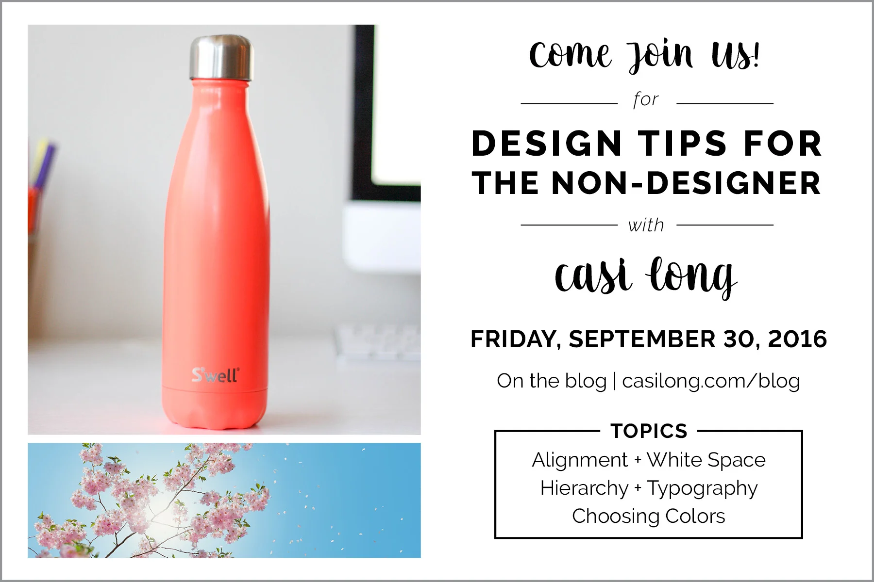
The first thing you should see is the event title “Design Tips for the Non-Designer”. Next, you should see “Casi Long”, “Come Join Us!” and the date “Friday, September 29, 2016.”
In this example below of poorly-used hierarchy, you aren’t sure where to look first.
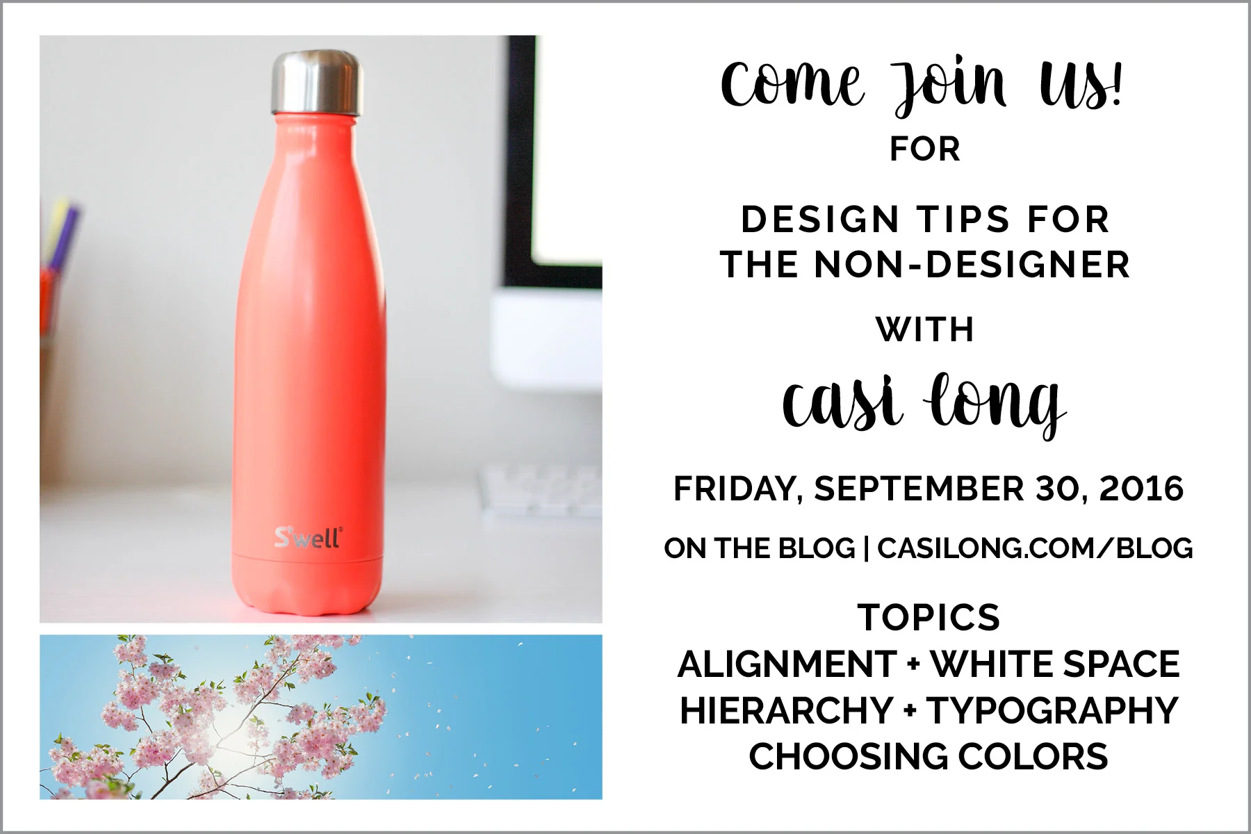
The first thing you probably noticed is my name. "Casi Long" isn’t giving the reader any substantial information. They aren’t sure where the event is, when it is, or what it’s about unless they keep reading.
Be sure to attract the most attention to the most important information.
2 | Typography (also known as fonts)
Stick with two or three fonts (at most) in one document.
I generally try to stick with two, and use weight variations of those fonts.
For example, Raleway has several varying weights—light, regular, italic, bold—so I use different weights to call out different parts of a document, without incorporating 4 unique fonts. This helps maintain consistency.
Use scripts sparingly. I would suggest using only one script per document.
They are typically harder to read, so use them only when necessary—as an accent.
You can apply bold or ALL CAPS to call something out.

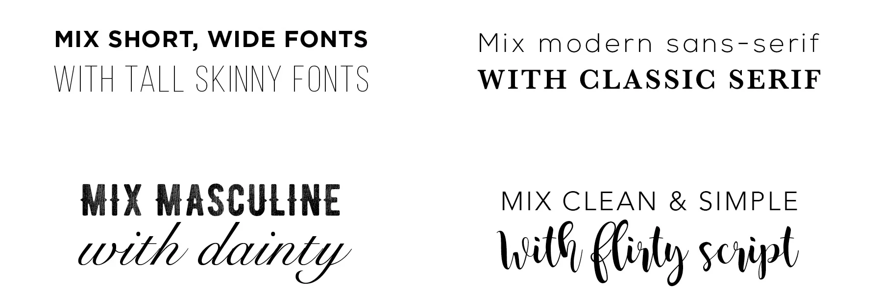
Here’s an example of poorly-used typography.
This example uses 4 fonts: 2 scripts and 2 sans-serifs. The scripts are competing with each other instead of complimenting. This example is cluttered and unclear of which information I should read first.
Use fonts that are high in contrast.
You can also use color to create hierarchy, which I’ll discuss in greater detail in the next post.
Maintain Consistency
Try not to create a different style for every item. Instead, establish one or two styles and stick with those.
Decide on a header style, a body text style and maybe a subhead.
Example: Google docs uses a specific style for all heading 1 items and a different style for body text, yet all the body text matches each other.
Size 10pt or 12pt is the norm for body text. When you need to call attention to information, bump the size up to 16pt or 18pt.
Creating a large differentiation between sizes will purposefully set content apart.
For items of equal importance, use the same font, weight and size.
To recap:
Rank your information from most important to least important before you begin.
Use bold, all caps, script fonts, or color to set information apart.
Use 2 or 3 fonts per document.
Use varying weights of those 2 or 3 fonts to set information apart.
Use scripts sparingly
Use fonts that are high in contrast.
Maintain consistency throughout the document.
Step back and evaluate your piece.
I hope these simple tips are helpful when designing. To check out the final part of this series on choosing color, click here.
What are your biggest hangups when designing something on your own?