Design Tips for the Non-Designer: Choosing Color
In the past two posts you read about how non-designers can use alignment, white space, hierarchy, and typography to create professional-looking designs.
I wanted to wrap up this series by talking briefly about how to choose color.
This can be tricky, because color rules are less concrete than other rules like typography. To get you started off on the right foot, here are a few basic rules for choosing the right colors for your design.
You may have noticed in the past two posts (Alignment + White Space, Hierarchy + Typography) the example text was purely black and white. Designing in black and white first is a method most designers use. If you layout your text using color, your judgement can be clouded by your reaction to a color instead of the actual layout of the text.
Stick with 2 or 3 colors.
Simple is better. Too many colors—especially if your design contains photos—can be distracting.
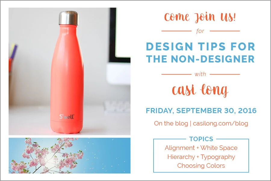
To look more professional, use colors other than the default colors.
Most people know the default color for hyperlinks is bright, cobalt blue. A simple way to make your document, slides, or emails appear custom is to change those link colors to something other than the default.
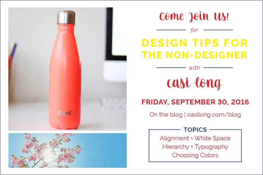
The same applies to flyers, cards, announcements or advertisements. Try not to use the default 100% red or 100% yellow. Instead, adjust the colors to something a little less harsh.
There are a couple methods you can use when selecting custom colors.
1 | Match the colors to the photographs in your design.
2 | Use your branding colors to make the piece cohesive with the rest of your materials (if your design doesn't include photos).
Legibility is often a big factor when choosing colors.
Avoid using red or yellow text as it can be difficult to read.
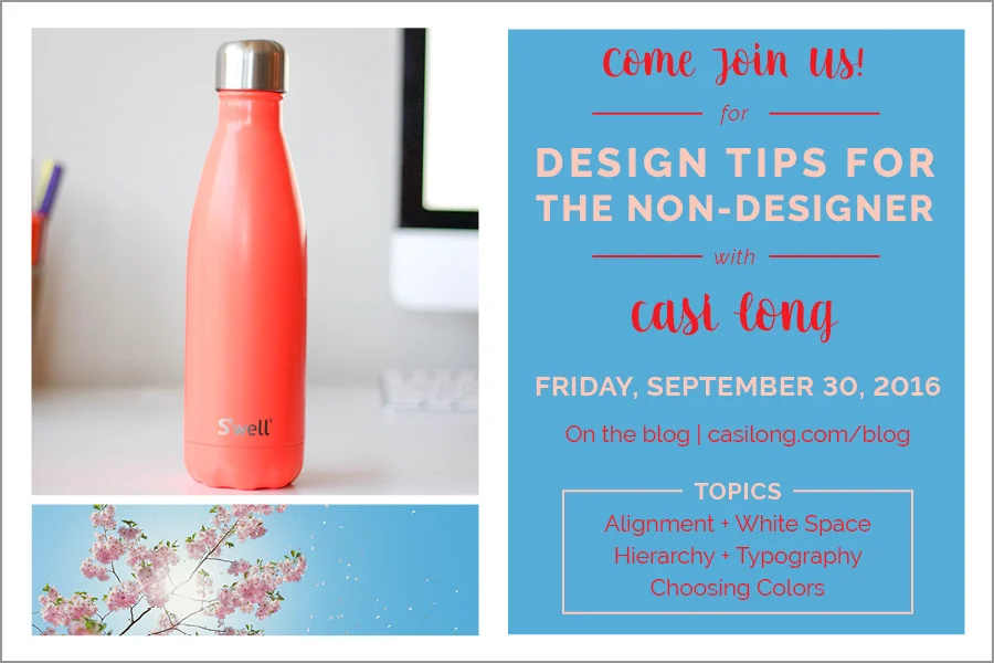
When putting text over a block of color, I recommend using black, white, or dark navy text. Using bright colors over another color will cause readability issues and can appear a little cheesy.
If you aren’t sure if your piece is legible, try moving further away to read it. If you find yourself squinting due to legibility (not from being too far away), you may want to adjust the colors.
You can also use colored lines as dividers, which can be an easy way to incorporate pops of color.
If you missed the last two posts from this series, you can check them out here: Alignment + White Space, Hierarchy + Typography
What are some common issues/questions you have while designing?

