
Design Tips for the Non-Designer: Alignment + White Space
Have you ever tried to design something and couldn’t quite put your finger on why it wasn’t working? If so, this series is for you.
Over the past few years I have discovered a few tips and tricks for designing pieces like flyers, cards, advertisements, magazines, or books.
I will walk you through a few simple rules for making a card.
This series will consist of 3 Parts. Part 2 will be covering hierarchy + typography, and part 3 will be about choosing color.
Let’s dive in.

1. Alignment
This is #1 on my list for a reason. This is super simple, but is often overlooked. Using proper alignment will make your flyer, postcard, or advertisement appear more professional.
If you’re using Adobe InDesign make sure you have your guides showing and use them! This is what they were created for.
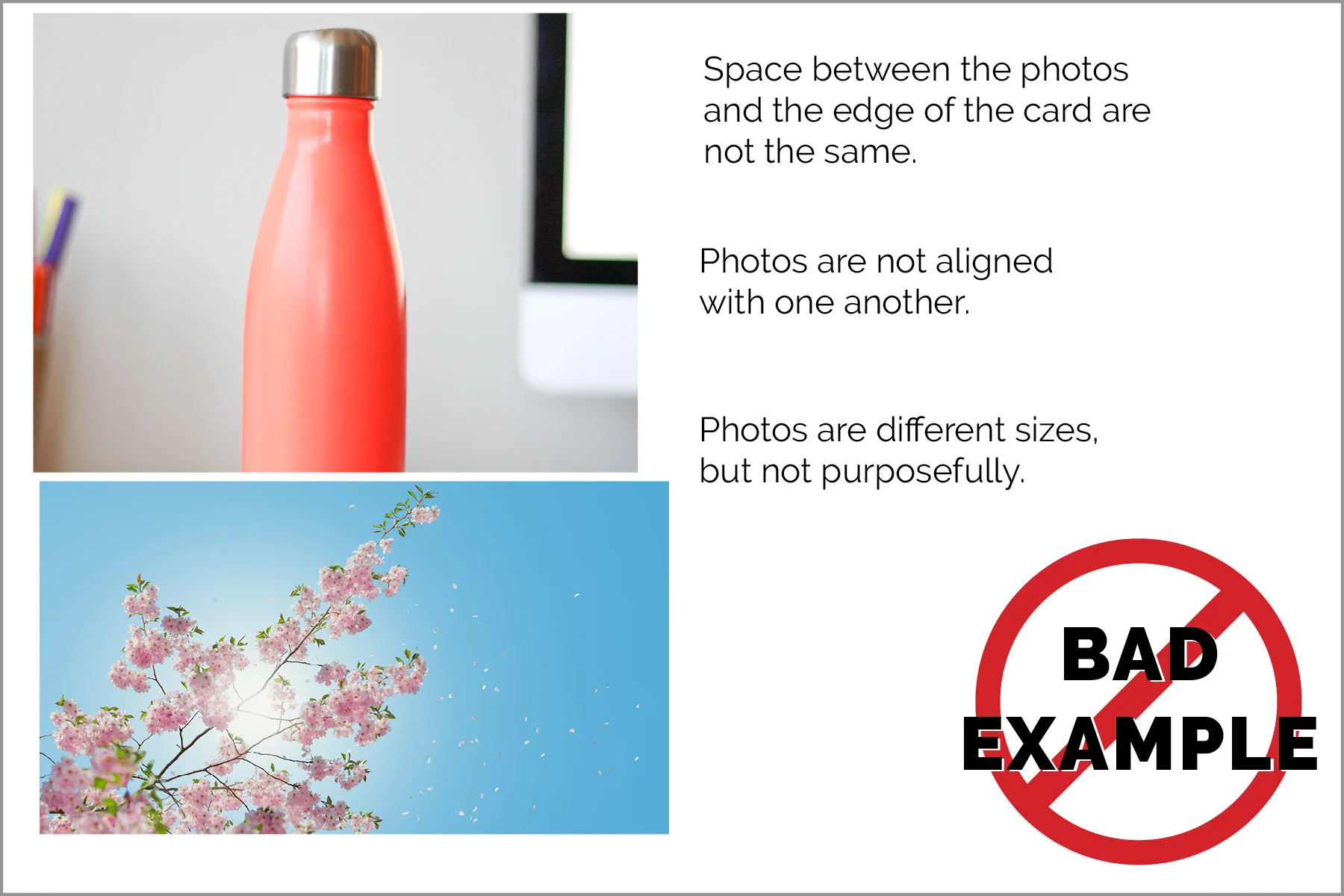
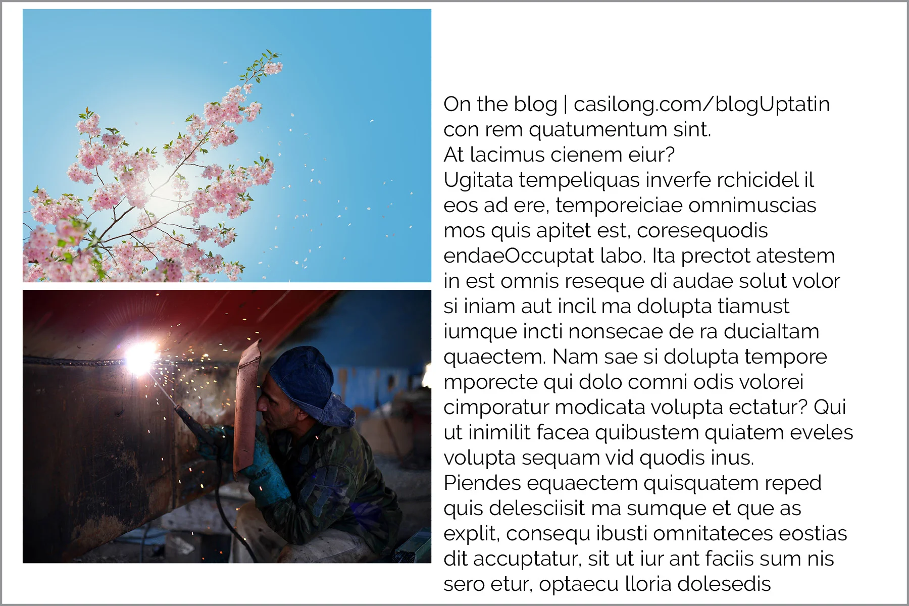
Align photos with one another.
Always make sure the edges of your photos are in line with one another, like in the examples below.
Try to keep your images the same size.
If you use different-sized images, make sure they are purposefully different sizes—not just slightly. Slight variation in size makes it look like an accident.


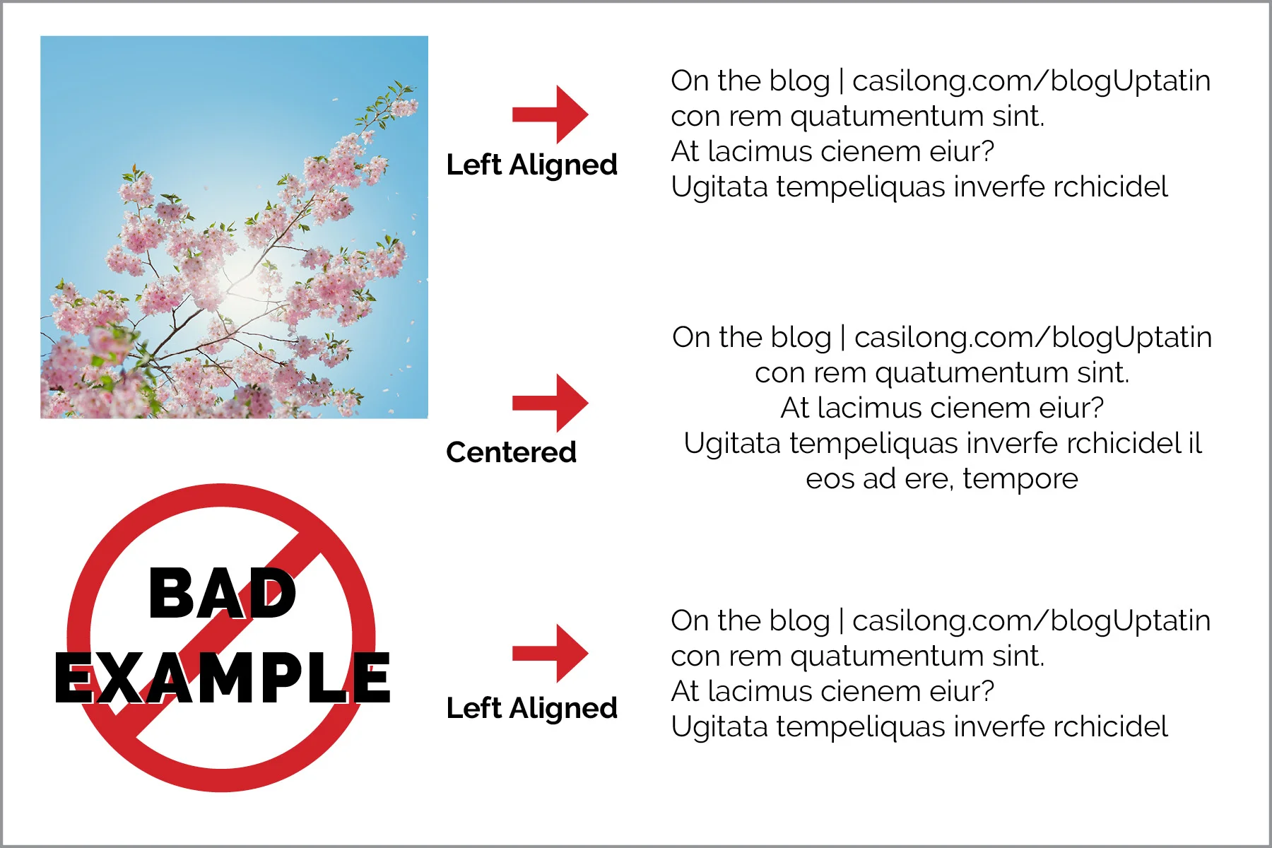
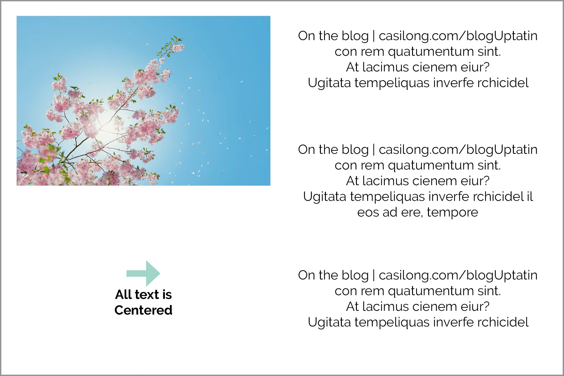
Align text consistently.
Your text should have the same alignment format throughout the card. There are always exceptions to the rule, but generally speaking ALL the text in one document should be either left-aligned, right-aligned, or centered.
Left-align is the easiest to read and the most commonly used.
Try not to mix and match like in this example:
Instead, keep it consistent throughout the document, like this example.
2. White Space
Simple is better.
Most people think they should fill up every square inch of a flyer or ad, when in reality, too much information can be overwhelming for the viewer. When there are too many competing pieces, the viewers aren’t sure where to look.
Pair your content down to the essentials. If you still have too much content, you may try redirecting your viewers to a website for more information. A simple, “for more information, visit www.yourwebsite.com” would suffice.
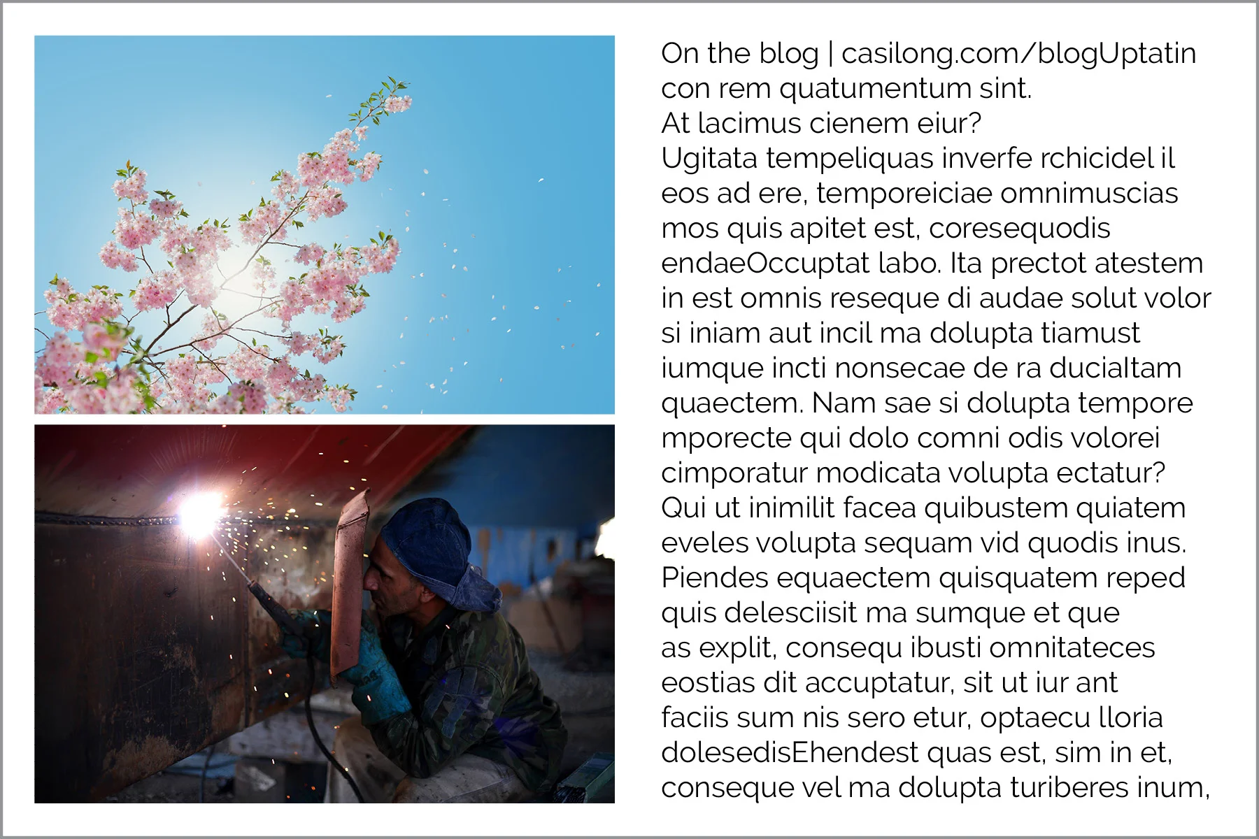
One or two photos is typically adequate.
White Space is your friend. Give the elements room to breathe.
I typically give each element in my designs at least .125” breathing room from the next element or edge of the page.
Just like people need personal space, elements on a page need the same. Don’t overcrowd or try to cram too much content into a small space.
Use equal spacing around all the edges.
I typically leave between .15” and .25” space along the edges. Whatever you choose, make sure it’s the same amount around all four edges of your card or flyer.
Here’s an example of what not to do:

To sum up:
Align photos with one another.
Align text consistently
Simple is better
White space is your friend. Give the elements room to breathe.
Use equal spacing around all the edges.
Check out Part Two: Hierarchy + Typography
Were these tips helpful for you? What are your greatest struggles when designing?