
How to Select the Best Color Palette for Your Brand

When you think of your favorite brands, what comes to mind? Is it their logo, their photos, or maybe even a feeling? I’m willing to bet when you think of the store Target you automatically see bright red in your mind. And, if I say ‘Tiffany’s’ I am confident you picture the iconic icy blue that has made the store so famous.
Color is one of the first components we each associate with a well-established brand. That immediate connection is why it’s so important to make certain you select the best possible colors to convey the desired message to your audience.
Selecting a color palette can be tricky, especially for those of you who may feel you don’t have an “eye” for this sort of thing. But rest-assured, there is a simple, proven process to make sure your color palette is the perfect portrayal of your brand.
Step 1 | Create a Pinterest inspiration board
The easiest ways to gather inspiration for a color palette is to create a Pinterest board. Use the board to gather 20-30 images you like. I typically try to find a variation of image styles: home decor, lifestyle images, clothing/outfits, textures/colors, and design inspiration (like fonts or logo designs).
Gather any and all images that stand out to you. Trust your natural instincts as to what images connect with the message you want your brand to convey. You’ll most likely find that several of your images resemble each other and have a particular style or theme. Once you have a wide selection of pins to review, look back through the set and ditch those that don’t seem to match the rest of the group.
I like to narrow down my images to 6 or 8 of my absolute favorites and make sure they have similar tone and colors to them. I do this by putting those images together on an inspiration board (using Adobe InDesign) in order to simplify.
You can also simply save the images to your desktop and view them as a collection next to one another. The key takeaway is to make sure the images you’ve compiled convey a sense of cohesive identity for your brand.
Step 2 | Choose main colors that you find recurring throughout the images
Once you feel like the images on your board “match” one another, observe the collection as a whole and take note of recurring colors. I usually find two to four colors on my boards that fit this description.
These colors should be your top priorities for your brand color palette. They should complement each other and be of a similar tone or shade.
Tip: If you’re using any Adobe products, you can use your eyedropper tool to select colors directly from the images. This saves time and improves accuracy for matching shades!
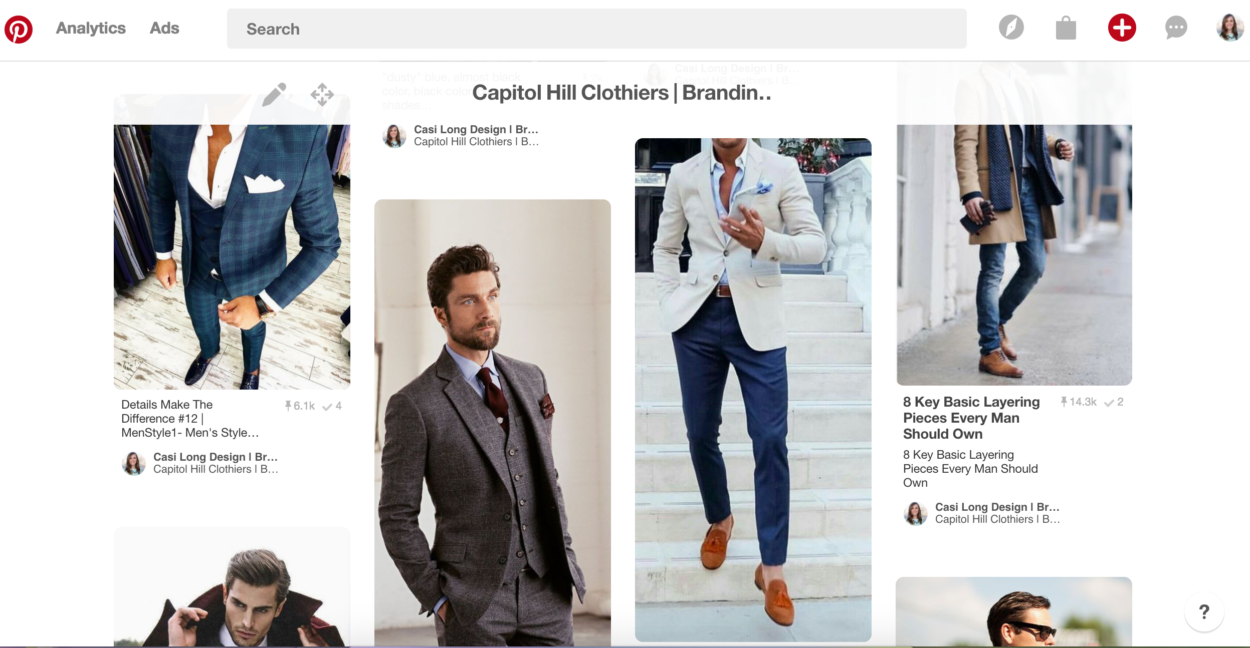
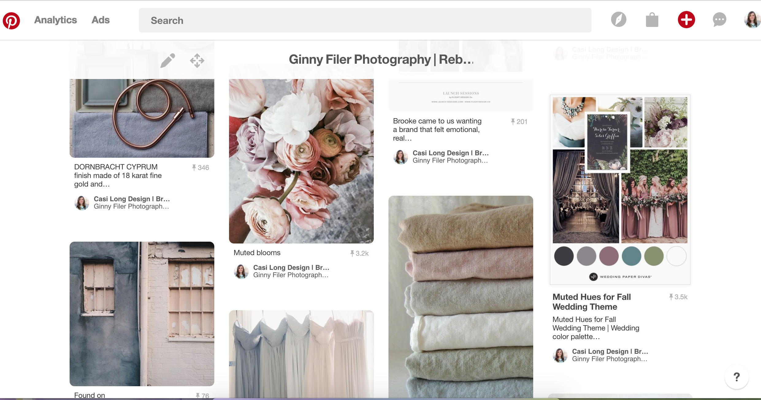
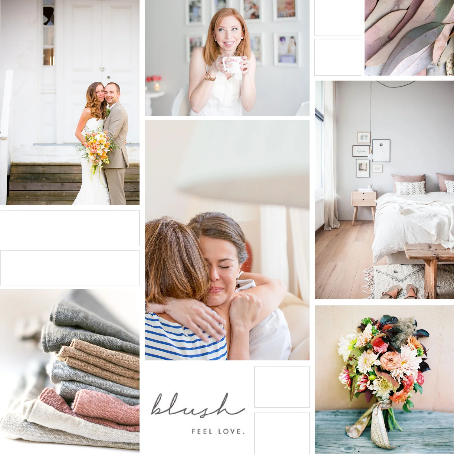
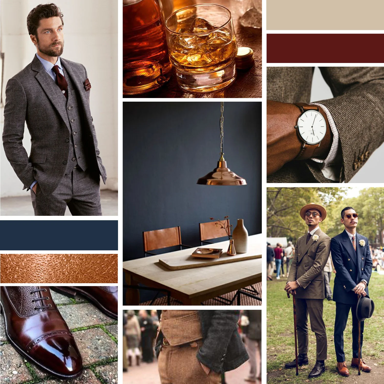
I completed these two inspiration boards by pulling colors directly from the images.
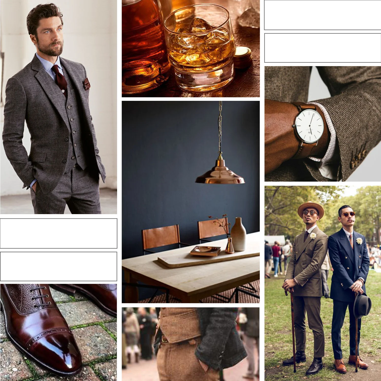
For this clothing company’s brand, I pulled colors from the suit combinations: navy, burgundy, and khaki. I also pulled from the navy and copper home interior photo. You may also get a classic, sleek vibe from these images and colors. This was crucial as I created a brand that represented the core of my client’s business.

For this photographer’s brand, I noticed a theme of soft, muted colors. I also knew her photography was light and airy, so I wanted to keep the focus on her images by selecting colors that embody that gentle tone instead of ones that were too bold or eye-catching. You likely get a peaceful and natural vibe from these selections, which paired well with the client’s photographic style.
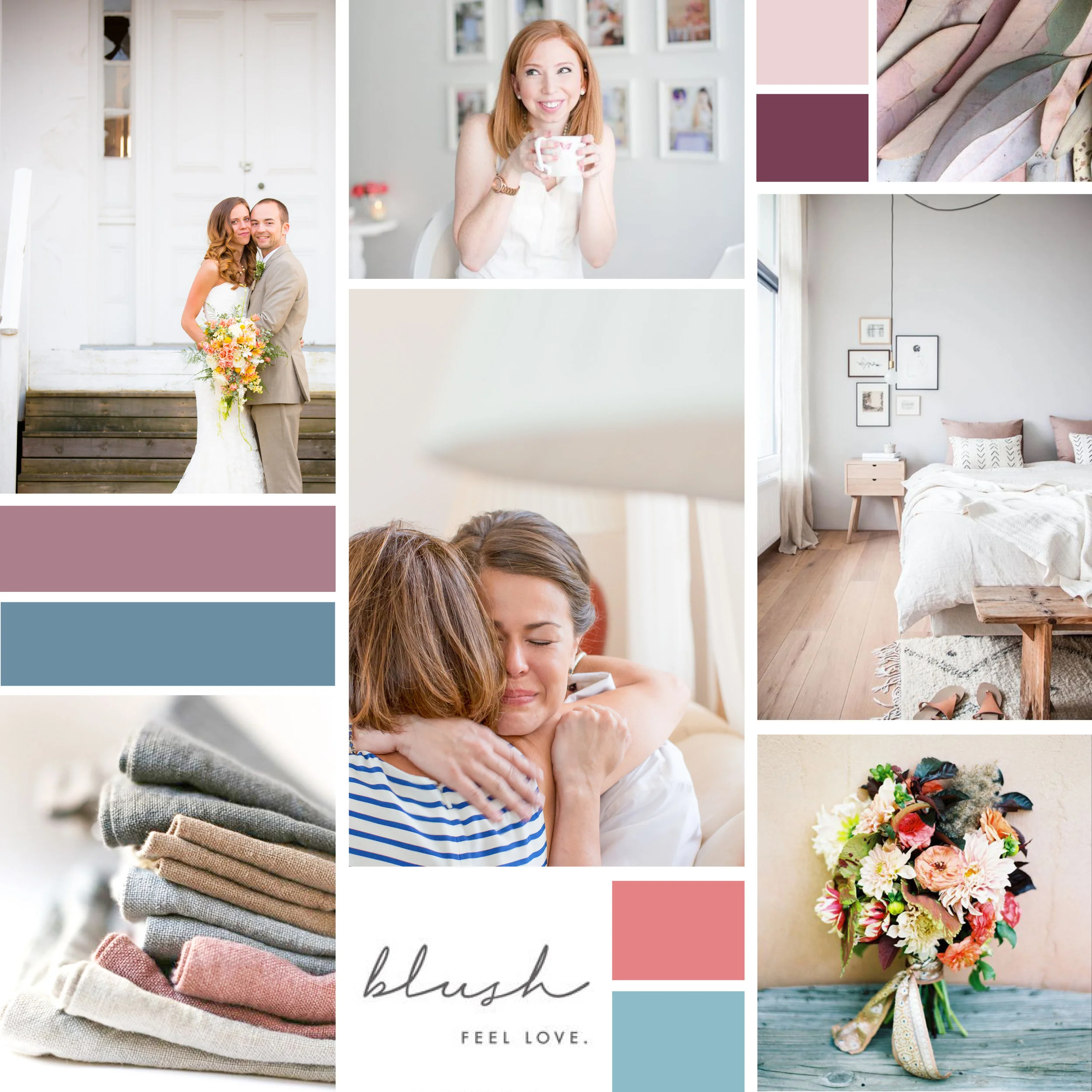

To compare to the muted colors in the previous brand, here’s an example of a board with bright, neon colors. See the difference?
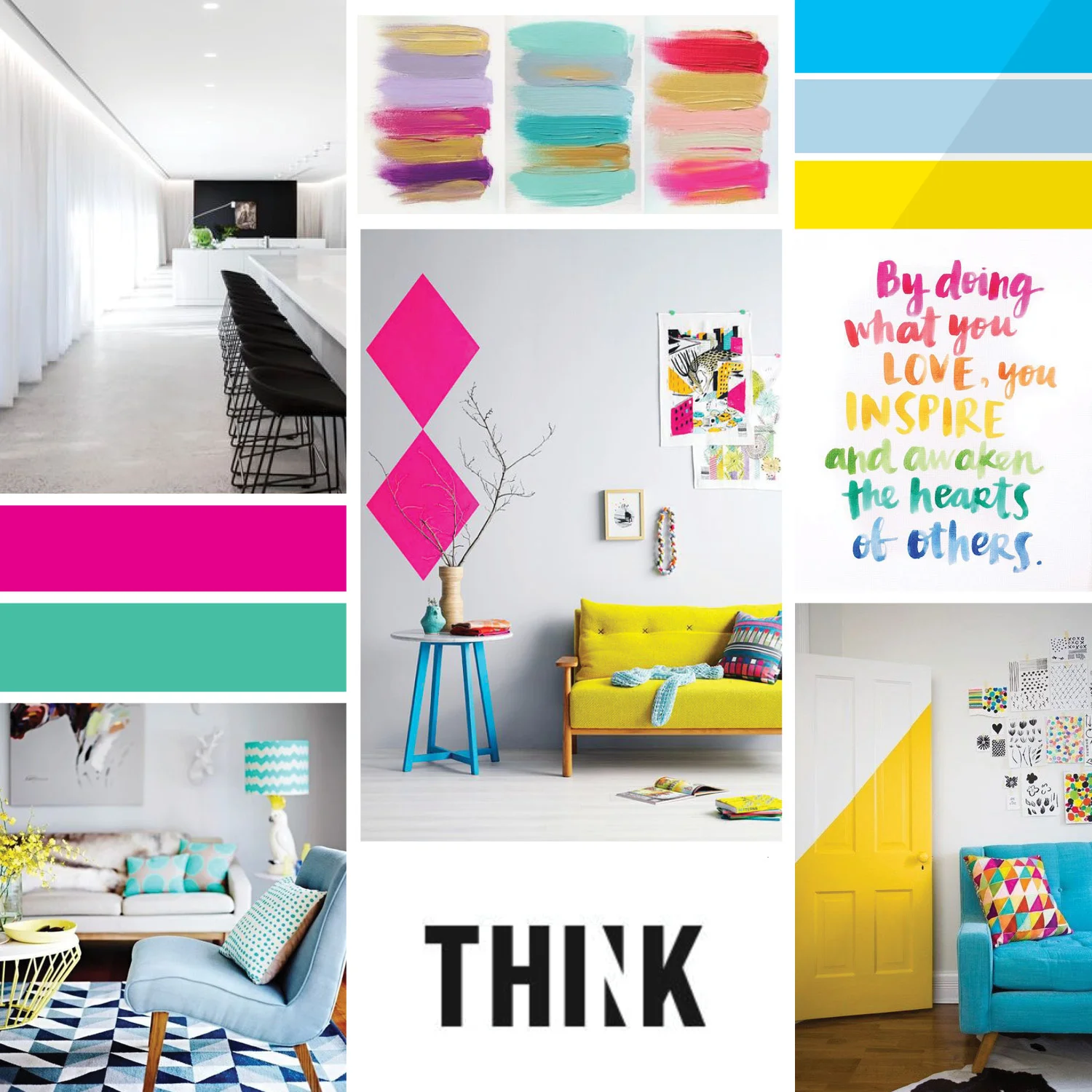

Tip: Generally avoid mixing soft, muted colors with bright neons because they give off very different vibes. You don’t want to send mixed messages that will confuse potential customers.
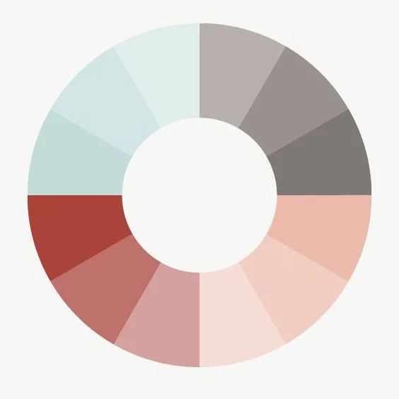
Step 3 | Choose complementary colors
Once you’ve picked your main colors, you may only have 2 or 3 colors to incorporate into your brand. If that’s the case, you will want to select complementary colors to give yourself some flexibility with your palette. This will be helpful when selecting images, creating graphics, and designing your website. I always try to find a good balance of darks and lights so I can use the darker colors for text and the lighter shades as accent colors.
There are a couple methods you can use to create your extended color palette.
One way is to create lighter or darker tints of the same colors.
For example, if your main color is Navy, you could select a complementary color of light blue (or vice versa). Or for a deep purple, try using a lighter purple as it’s complementary color.
Here are a few examples of palettes using this method of lighter and darker shades of the same color. Doesn’t it just feel so cohesive? I love it!


Another option for creating an extended color palette, is to use colors all in the same hue. For example, choose all bright, bold colors that match each other in intensity, like this:

Or choose a palette made up of soft, pastel colors like this:

If you select a muted palette like this, I recommend including one or two darker colors to use for text so it’s legible to your readers.
Hopefully this gives you a starting point for how to create a color palette that truly represents your brand. You will be amazed at how impactful the correct color palette can be for your business!
If you have questions or would like feedback on your color palette, feel free to comment below or email me directly at casi@casilong.com.
Also, if you’re interested in access to my inspiration board template, I’m happy to share it with you. Simply email me at casi@casilong.com with the subject line “Inspiration Board Template”.