
5 Impactful Ways to Customize your Squarespace Template

Your website is your main form of interaction with clients and readers. Potential customers may visit your site to view your work, check out your services, read your blog, or contact you. While they are bopping around your site, you want to make sure they get all the good vibes possible. You want them to see how serious you take your business so they'll take it just as seriously. Nothing says “legit business” like a custom, well-designed website.
There are many ways to make your Squarespace template unique and special to your business. So I put together a list of the ways I find most important.
1 | Apply your custom brand colors across your site
Before you start customizing your website, it’s important to think about your brand’s color palette. I recommend selecting 2-3 colorsto use for your website.
Side Note: If you are struggling in this arena, check out this blog post for help.
Squarespace makes it so easy to customize your site’s colors using the style editor on the left-hand side of your screen.


Inside the color panel, you’ll see a large selection of items of which you can adjust the colors. (They may vary based on your template.)
Here is a list of the main items I would adjust and what each one means:
Tip: Navigation refers to the menu items that help someone navigate throughout the pages on a website. Typically located toward the very top of a webpage.
Navigation color: The color your navigation items appear at all times.
Navigation (Hover) Color: The color your nav items appear when the mouse is hovered over top.
Navigation (Active) Color: The color of the nav item you are currently on. (Ex. If you’re on the about page, the “About” item in your navigation will be a different color than the rest of the navigation items.)
Note: I will often set my hover color and active color to be the same, but you certainly don’t have to. Here’s a website example where I used 3 different colors: one main nav color, one hover and another for active.


Heading 1 Color: I suggest using your main color.
Heading 2 Color: Use either your main color, or a prominent secondary color.
Heading 3 Color: Apply secondary color.
More on headings under point number 2.
Text Color: Your main text should be a neutral color that’s easily legible. (black, navy or gray)
Body Link Color: A word inside a body of text that links to another article or URL. I recommend using a color that contrasts your main text color, so it’s easy for readers to recognize.
Body Link (Hover) Color: The color of those ^ links when it’s hovered over by the mouse.
You can see a few body links in the image below
Social Icon Color: You can add a custom color to your social icons. This small change really makes a big difference.
Below left: default colors; Below right: custom colors.


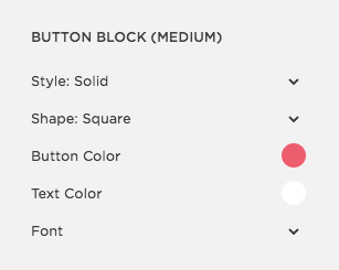
If you scroll down inside the style editor panel, you’ll see the Button Block area. Buttons are a great way to draw attention to any important action or feature on your website. You can customize buttons by adjusting the style, size, shape and text. Use the same style for every button on your site. They should be consistent throughout.
Here’s the breakdown of the Button Block section.
Style: Solid, outline, raised. (personal preference)
Shape: Square, rounded, pill. (personal preference)
Button Color: I recommend choosing a bright or bold color that’s easy to spot.
Text Color: The color of the text on the button. If your button is a dark color, use white text. If it’s a light color, use black or a dark color.
Font: The text font on your button. I recommend using the same font as your navigation or heading 1.
2 | Apply your brand fonts throughout your site
Another important factor when making your website appear custom and unique, is to apply your brand’s unique fonts to your website. Even if your font choices are used on other websites, the way you use and apply them can make your website unique.
Here’s a helpful post on selecting your brand fonts.
Consistency is key across any design, especially a website. It’s important to use your fonts (and the size, weight, color of them) to help your viewers understand the levels of importance within your text.
Think about putting together a document for a client, or an itinerary for a vacation (shoutout to my Father-in-law who never fails in this department). You don’t use the exact same size, weight, and positioning for every single word in the document. Hopefully, you create hierarchy by selecting a larger size or weight for the heading than for the normal body text in the document.
Tip: If your logo uses a unique/distinct font, try to tie that into the rest of your website in some way. But warning: If your unique font is a script or something difficult to read (like mine!) use it sparingly. I use my script font for one-word graphics.
You can draw attention to certain areas by using the same font, but vary the weight and size.
Here's a breakdown of the typography panel:

Navigation: You want to use a legible font that’s not too light-weight. Typically a serif or sans-serif is best for the navigation menu.
Heading 1: This will be used mostly for headlines and brief statements. Heading 1 is typically applied to the most important information (like your mission statement, or an advertisement). This font should be a serif or sans-serif, and should be large and a heavy weight.
Heading 2: I recommend making this font a smaller, lighter version of heading 1. I typically apply the same font to both heading 1 and 2, but differentiate the two using color, size and weight.
Heading 3: Used sparingly. If you have a distinct brand font (like a script or specialty font) here’s the place to use it. Heading 3 should only be used a handful of times across your site for special call outs.
Body Text: The most used across any site. This should be a serif or sans-serif, somewhere between the size of 10-14pt. Make sure it’s very legible, as it will represent around 90% of your website’s content.

3 | Insert Custom Graphics + Icons
When you look at some of your favorite Squarespace websites, you’ll notice they have special features unique to their particular site. An easy way for you to accomplish that uniqueness with your own site, is to create custom graphics.
A graphic could be an image with text over it, or some sort of design element incorporated. Here are a few examples of graphics on my website:

All graphics...

One big graphic created in Adobe Illustrator

How to insert graphics:
Save the graphic as a JPEG or PNG. I typically use Illustrator or Photoshop to create graphics, but you may have a program like Canva—any program is fine! The key is to save the graphic as a JPEG or PNG so you can easily insert it on your site.
TIP: JPEGs have a white background, while PNGs have a transparent background.
Insert the graphic as an Image. It’s super easy. You simply choose where you want your graphic, select insert image, and select your graphic (saved as JPEG) into that spot.
Where to place graphics + icons?
You don’t want to just start plopping icons and graphics anywhere, so there is a strategic way to decide when and where to use them. I typically use graphics to…
1. Achieve a look I can’t achieve by adjusting the settings in Squarespace.
2. Add a visual element that will catch the viewer’s attention better than words would.
Here are two examples of how icons can be used to make the information easier to digest.


4 | Add a custom Favicon
A favicon is the little icon you see in the tab of your browser. The default favicon for Squarespace websites is a 3-D black box until you change it. For Gmail, it’s a red and white envelope. For my website I use an icon of me. :)

This may seem like a tiny alteration, but honestly it’s one of the first things I notice when I open a website. If the site has a custom icon—instead of the default favicon—I automatically take their site/brand/business a little more serious.
I recommend using a simple shape as your favicon. If your logo includes a distinct element, use that element. Avoid using text or a complicated graphic. The favicon appears so small it needs to be simple so readers can easily distinguish.
Here’s how to add a custom favicon to your site:


Tip: I would suggest using a PNG for the transparent background.
5 | Delete "Powered by Squarespace" from the footer
Every Squarespace website has a default “Powered by Squarespace” message at the bottom of the page. A super simple way to make your website appear more custom & professional, is to remove it.
Here’s a quick tutorial on how to delete this line of text.
You don't have to use code to make your website unique. Just a few small tweaks can make a world of difference.
Remember: clean, efficient and authentic is my design motto and I think it should be yours too. :)

What questions do you have? Let me know in the comments below.